We have managed to fulfil the majority of our web application user interface requirements using the JSF Standard. However, we want to get the most out of our web application that we possibly can. The use of external JSF libraries is necessary to enable us to do this. The following digression will look at PrimeFaces as an example.
Though JSF provides a framework for the development of web applications, it provides only a limited number of UI components. These components are often insufficient for the implementation of a professional web application. However, the ongoing standardization of JSF has made the development and use of additional libraries noticeably simpler.
Popular additional libraries are Apache MyFaces, ICEFaces, RichFaces and PrimeFaces. Though the simultaneous use of multiple additional libraries is possible, it is usually advised against to preserve the UI’s visual consistency. We will use PrimeFaces for our project.
Again, you can continue to work in your own Codenvy workspace or you can use the following project state in a temporary workspace.
My-Campaign after Chapter 8 (Remaining Use Case)
PrimeFaces is a JSF component library offering a number of very useful extensions. The library is considered lightweight due to it consisting of just a single Java archive (JAR file) and due to the fact that no particular configuration is required and it has no dependencies to other libraries. The JAR file must be available in the project and the Facelet must be provided with the correct namespace: these are essentially the only two things required to enable us to use the library’s tags.
10.1 Installation Using Maven
Since we’re managing our project configuration with Maven, we must adjust a few settings in the pom.xml file to enable Maven to use the desired version of PrimeFaces. To this, we must amend the file with a dependency:
...
<dependencies>
	...
	<dependency>
		<groupId>org.primefaces</groupId>
		<artifactId>primefaces</artifactId>
		<version>5.3</version>
	</dependency>
</dependencies>
...
And that’s it! We can begin using the PrimeFaces tags in the Facelets immediately. Please refer to the PrimeFaces documentation if necessary. The XML namespace for the PrimeFaces tags is: xmlns:p="http://primefaces.org/ui" and has to be declared in each Facelet using PrimeFaces components.
10.2 New Choice of Colours for Editing the Donation Form
Now that we have access to the PrimeFaces library, the first improvement we want to make relates to the Facelet editDonationForm.xhtml – the input screen for the use case Edit donation form. Combo boxes are provided in the form to enable the user to choose their desired background and text color. The URL of the donation form is displayed in a text area and adjusts itself automatically to account for the currently selected color (see Fig. 8-4). The combo boxes display a text representation of the colors with their hexadecimal values. In situations where a limited choice of colors will suffice, this approach can work. If the user wishes to select a color at will, however, this input component is highly unsuitable. We are going to use PrimeFaces to rectify this current disadvantage of our application. The optimization process refers back to the requirements. There, we defined the need for the view to contain colorpicker controls that can only return valid color values.
New Tags for Color Selection
The PrimeFaces library offers a special component for choosing colors, the color picker. This component allows the user to pick colors from a color palette. The advantages of this are twofold: as well as allowing the user to pick any color, it also lets them the see the color itself on the screen. The tag <p:colorPicker> can be used to add a color palette to a Facelet.
<p:colorPicker> in a nutshell
Component for picking colors. The user chooses their desired color from the color palette provided.
Selected attributes:
id: Unique identifier of the component
value: Value of the component. Generally contains an EL expression that binds the parameter to an attribute of type String in a bean.
widgetVar: Identifier for the client-side processing with JavaScript
Like standard tags, this tag can be configured using attributes. Attributes with the same characteristics have the same name in PrimeFaces as they do in the JSF Standard. Attributes taking the same name include the id and value attributes.
<p:colorPicker id="bgColor"
	value="#{editDonationFormController.bgColor}"
	widgetVar="bgPicker">
</p:colorPicker>
While the color picker lets us enhance the experience of the user when picking colors, it also causes us to lose the dynamic that we achieved in the combo box using the <f:ajax> tag. Unfortunately, the current version of PrimeFaces does not offer the opportuntity for the URL in the text area to be adjusted directly after a color change using Ajax. However, the PrimeFaces command button (<p:commandButton>) does. We will therefore introduce an extra button, Update URL, to update the URL text area using Ajax.
The appearance of the same components in different libraries can sometimes vary drastically. The standard components of JSF differ significantly in appearance from the components of PrimeFaces. Since the purpose of this digression is to try out PrimeFaces, we will replace all standard components with the corresponding PrimeFaces extensions. This makes the appearance of the site more uniform.
Let’s look at athe Facelet editDonationForm.xhtml. Here, we won’t only replace the buttons (tag <h:commandButton>), but also the text areas (tag <h:textarea>) in which the URL is displayed (see Listing 10-1). The attributes are the same as for standard components, but have additional functionality. A useful, standard component-extending property of the PrimeFaces command button component is the attribute update, which allows us to specify that another component should be updated using Ajax when the button is clicked. As a value, the update attribute expects the id of the component to be updated (or a list of IDs from multiple components). We will use this functionality for our Update URL button. The url ID is the ID of the text area displaying the URL. When the button is clicked, the text area is the only part of the page that is refreshed using Ajax.
<p:commandButton value="Update URL" update="url" />
The Enhanced Implementation of Color Selection with PrimeFaces
We will first change the Facelet editDonationForm.xhtml as follows:
<html xmlns="http://www.w3.org/1999/xhtml"
	xmlns:ui="http://xmlns.jcp.org/jsf/facelets"
	xmlns:f="http://xmlns.jcp.org/jsf/core"
	xmlns:p="http://primefaces.org/ui"
	xmlns:h="http://xmlns.jcp.org/jsf/html">
<body>
	<f:view contracts="#{view.locale.language}">
		<ui:composition template="/template.xhtml">
			<ui:define name="content">
				<h1>#{msg['editDonationForm.edit_donation_form']}</h1>
				<h:form>
					<h:panelGrid columns="2">
						<h:outputLabel
							value=
								"#{msg['editDonationForm.background_color']}:">
						</h:outputLabel>
						<p:colorPicker id="bgColor"
							value="#{editDonationFormController.bgColor}"
							widgetVar="bgPicker">
						</p:colorPicker>
						<h:outputLabel value=
							"#{msg['editDonationForm.text_color']}:">
						</h:outputLabel>
						<p:colorPicker id="textColor"
							value="#{editDonationFormController.textColor}"
							widgetVar="textPicker">
						</p:colorPicker>
						<h:outputLabel value=
							"#{msg['editDonationForm.form_url']}:">
						</h:outputLabel>
						<p:inputTextarea id="url"
							rows="6" cols="30" readonly="true"
							value="#{editDonationFormController.url}" />
					</h:panelGrid>
					<p:commandButton value="Update URL" update="url" />
					<p:commandButton value="OK"
						action="#{editDonationFormController.doOk}"
						ajax="false" />
				</h:form>
			</ui:define>
		</ui:composition>
	</f:view>
</body>
</html>
Listing 10-1 Facelet editDonationForm.xthml
We will test the changes immediately after this adjustment by executing our Maven build and deployment and accessing the page for editing the donation form in the browser. In Fig. 10-1, we see the new choice buttons for picking the colors. The current selection is displayed on the button as a square.
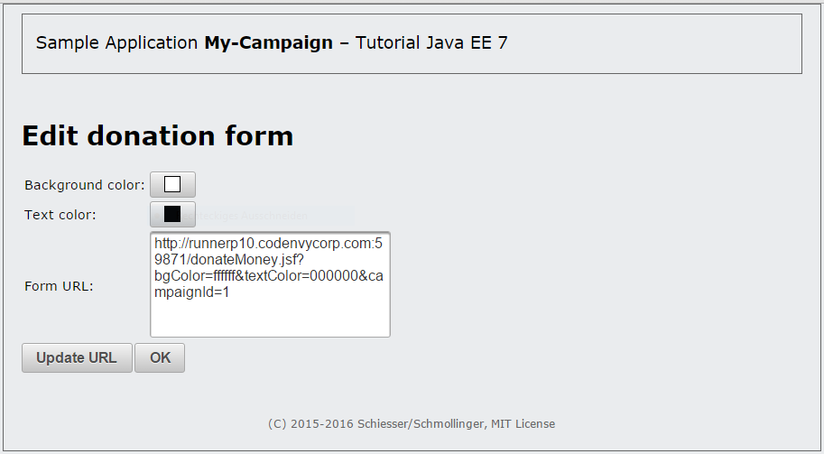
Fig. 10-1 The view for editing the donation form of a campaign with the PrimeFaces color picker
Clicking the button brings up a color palette (see Fig.10-2). After choosing a new color, we can update the URL accordingly by clicking on the button Update URL.
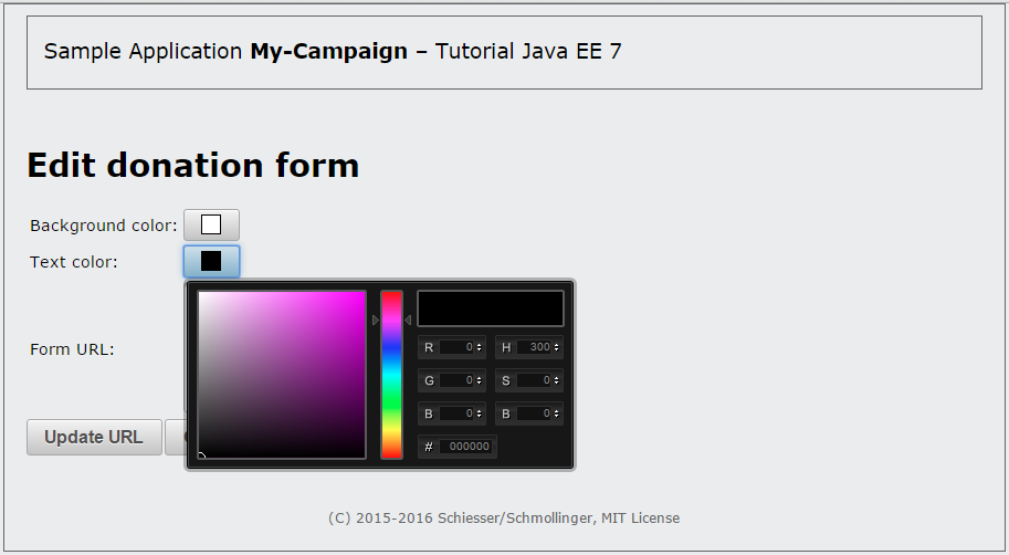
Fig. 10-2 The view for editing the donation form of a campaign with PrimeFaces color selection and the color palette open
ajax="true" or ajax="false"?
If we look more closely at the Facelet in Listing 10-1, we notice that the tag <p:commandButton> is used once for the button Update URL and once for the button OK, but the attribute ajax is only given the value false in the latter of these two cases. Why?
The PrimeFaces command button executes an Ajax request by default, which means that the affected components are the only ones to be processed and re-rendered on the server side. If the attribute ajax is set to false, a complete Faces request is run. Since the Update URL button should update only the text area containing the URL, an Ajax request is the right choice here. In contrast, when the OK button is pressed, the entire view is changed. This necessitates a complete Faces request, which means that ajax="false" is what we should choose.
10.3 Tabs for Creating and Editing Campaign Data
In line with the requirements, the campaign data must be represented using tabs. Since the JSF standard does not support tabs, our implementation so far has required us to display all the data at once. We can now use the PrimeFaces library to implement tabs very easily.
The New Tags for Tabs
Tabs can be built into a page very simply using the tags <p:tabView> and <p:tab>.
<p:tabView> und <p:tab> in a nutshell
Components for implementation of a tabbed panel
<p:tabView>
A Tab View provides the frame for the individual tabs
Selected attributes:
id: Unique identifier of the component
<p:tab>
A tab is a child element of the Tab View.
title: Title of the tab
We only need a few attributes for our implementation. The basic structure then appears as follows:
…
<p:tabView id="tabView">
	<p:tab title="#{msg['editCampaign.general']}">
	...
	</p:tab>
	<p:tab title="#{msg['editCampaign.bank_account']}">
	...
	</p:tab>
</p:tabView>
The Enhanced Representation of Campaign Data with PrimeFaces
Our implementation has so far involved a form (tag <h:form>) containing two grids (tag <h:panelGrid>). In our new implementation, we will embed a Tab View in the form instead (see Listing 10-2). Each of the two grids will be placed in its own tab. Additionally, we will replace the standard component <h:textfield> with the PrimeFaces component <p:textfield> for the text inputs and the standard tags <h:message> and <h:messages> with the PrimeFaces tags <p:message> and <p:messages> to achieve as uniform an appearance as possible. We use the latter to ensure that possible errors in the hidden tab are made visible to the user. The attribute closable="true" gives the user the option to close the error screen.
<html xmlns="http://www.w3.org/1999/xhtml"
	xmlns:ui="http://xmlns.jcp.org/jsf/facelets"
	xmlns:f="http://xmlns.jcp.org/jsf/core"
	xmlns:p="http://primefaces.org/ui"
	xmlns:h="http://xmlns.jcp.org/jsf/html">
<body>
	<f:view contracts="#{view.locale.language}">
		<ui:composition template="/template.xhtml">
			<ui:define name="content">
				<h1>#{campaignProducer.addMode ?
					msg['editCampaign.add_new_campaign'] :
					msg['editCampaign.edit_campaign']}</h1>
				<h:form>
					<p:messages closable="true" />
					<p:tabView id="tabView">
						<p:tab title="#{msg['editCampaign.general']}">
							<h:panelGrid columns="3">
								<h:outputLabel value=
									"#{msg['editCampaign.name']}:">
								</h:outputLabel>
								<p:inputText id="a_name"
									value=
										"#{campaignProducer.selectedCampaign.name}"
									validatorMessage=
										"#{msg['editCampaign
											.campaign_name_validation']}">
									<f:passThroughAttribute name="placeholder"
										value=
											"#{msg['editCampaign.name_of_the_campaign']}" />
									<f:validateRequired />
									<f:validateLength minimum="4" maximum="30" />
								</p:inputText>
								<p:message for="a_name" />
								<h:outputLabel value=
									"#{msg['editCampaign.target_amount']}:">
								</h:outputLabel>
								<h:panelGroup>
									<p:inputText id="a_targetAmount"
										value=
											"#{campaignProducer
												.selectedCampaign.targetAmount}"
										validatorMessage=
											"#{msg['editCampaign.target_amount_validation']}">
										<f:convertNumber maxFractionDigits="2"
											minFractionDigits="2" />
										<f:validateRequired />
										<f:validateDoubleRange minimum="10.0" />
									</p:inputText> EUR
								</h:panelGroup>
								<p:message for="a_targetAmount" />
								<h:outputLabel value=
									"#{msg['editCampaign.donation_amount']}:">
								</h:outputLabel>
								<h:panelGroup>
									<p:inputText id="a_donationMinimum"
										value=
											"#{campaignProducer
												.selectedCampaign.donationMinimum}"
										validatorMessage=
										"#{msg['editCampaign.donation_amount_validation']}">
										<f:convertNumber maxFractionDigits="2"
											minFractionDigits="2" />
										<f:validateRequired />
										<f:validateDoubleRange minimum="1.0" />
									</p:inputText> EUR
								</h:panelGroup>
								<p:message for="a_donationMinimum" />
							</h:panelGrid>
						</p:tab>
						<p:tab title="#{msg['editCampaign.bank_account']}">
							<h:panelGrid columns="3">
								<h:outputLabel value=
									"#{msg['editCampaign.name']}:">
								</h:outputLabel>
								<p:inputText id="b_name"
									value=
										"#{campaignProducer
											.selectedCampaign.account.name}">
									<f:validateRequired />
								</p:inputText>
								<p:message for="b_name" />
								<h:outputLabel value=
									"#{msg['editCampaign.iban']}:">
								</h:outputLabel>
								<p:inputText id="b_iban"
									value=
										"#{campaignProducer
											.selectedCampaign.account.iban}">
									<f:validateRequired />
								</p:inputText>
								<p:message for="b_iban" />
								<h:outputLabel value=
									"#{msg['editCampaign.name_of_bank']}:">
								</h:outputLabel>
								<p:inputText id="b_name_bank"
									value=
										"#{campaignProducer
											.selectedCampaign.account.nameOfBank}">
									<f:validateRequired />
								</p:inputText>
								<p:message for="b_name_bank" />
							</h:panelGrid>
						</p:tab>
					</p:tabView>
					<p:commandButton value="#{msg['editCampaign.save']}"
						ajax="false" action=
							"#{editCampaignController.doSave}" />
					<p:commandButton value="#{msg['editCampaign.cancel']}"
						immediate="true" ajax="false"
						action="#{editCampaignController.doCancel}" />
				</h:form>
			</ui:define>
		</ui:composition>
	</f:view>
</body>
</html>
Listing 10-2 Facelet editCampaign.xhtml
After carrying out a new deployment, we can try out our changes. The result is shown in Fig 10-3.

Fig. 10-3 The view for editing a campaign after integration of the Tab View component from PrimeFaces
10.4 The Confirmation Dialog Box for the Use Case Delete Campaign
Though we have not yet implemented the use case for deleting a campaign, we have already built a link into the listCampaigns.xhtml Facelet for invoking the deletion method in the controller (see link with the label “x” in Figures above). The deletion of data is a sensitive process in applications. A user can easily click on a link by mistake and find the data record gone. For this reason, we want to insert a dialog box that double checks with the user whether they really want to delete the campaign.
The New Tags for the Confirmation Dialog Box
The PrimeFaces library allows us to define a dialog confirmation box with the tag <p:confirmDialog>. The entire dialog box is controlled on the client side using JavaScript. Additionally, the component provides the JavaScript functions show() and hide() for displaying and closing the dialog box. The following summary of characteristics provides an overview of the most important attributes.
<p:confirmDialog> in a nutshell
Components for implementing a confirmation dialog box
Selected attributes:
message: Text of the dialog box that is displayed to the user
header: Title of the dialog window
severity: Severity of the message (alert/info)
widgetVar: Name of the client-side JavaScript object for the dialog box enabling accesses from other components. The JavaScript functions show() and hide() can be invoked using this name.
The basic structure of our confirmation dialog box therefore appears as follows:
<p:confirmDialog message="#{msg['listCampaigns.ask_delete_campaign']}"
	header=" Delete campaign"
	severity="alert"
	widgetVar="confirmation">
	...
</p:confirmDialog>
We can configure the content freely within the <p:confirmDialog> tag. Generally, however, buttons are used to confirm or cancel an action.
The Implementation of a Dialog Box with PrimeFaces
Alongside the introduction of the confirmation dialog box, we will also insert a button (<p:commandButton>) to replace the link with value “x” that has hitherto existed for the purpose of deleting a campaign.
<p:commandButton onclick="PF('confirmation').show()"
	actionListener="#{listCampaignsController.doDeleteCampaign(campaign)}"
	icon="ui-icon-close"
/>
This button is used to start the confirmation dialog box via the attribute onclick (using the widgetVar object, confirmation, and the JavaScript function show(). In Primefaces 4.0 and above the widgets are stored in a Javascript widget array PF. When you call PF('confirmation') it is looking for the corresponding widget in the array and returning it). Further, the button uses the attribute actionListener to invoke the Java method doDeleteCampaign in the ListCampaignsController controller on the server-side that should store the selected campaign in the session. We have access to the campaign to be deleted only at this point within the Facelet and must therefore invoke the deletion method here too, although it is not yet definite that the deletion is really desired by the user. For the reason, the method doDeleteCampaign can only serve to mark the campaign for possible deletion. The campaign can only actually be removed once the deletion has been confirmed. We’ll talk more about this later.
The attribute icon is a neat option in PrimeFaces that allows standard CSS classes from the ThemeRoller CSS framework to be used for displaying the button. For our current purposes, PrimeFace offers the class .ui-icon-close, which places an “x” on the button.
To implement the Facelet, we must once again begin by localizing a number of texts (category # listCampaigns.xhtml). To do this, we will insert the following rows in the file messages_en.properties:
listCampaigns.ask_delete_campaign=Really delete campaign?
listCampaigns.delete_campaign=Delete campaign
listCampaigns.yes=Yes
listCampaigns.no=No
The corresponding German translations will be added to the file messages_de.properties:
listCampaigns.ask_delete_campaign=Aktion wirklich löschen?
listCampaigns.delete_campaign=Aktion löschen
listCampaigns.yes=Ja
listCampaigns.no=Nein
Before we address the changes in the ListCampaignsController controller, we’ll look at the new implementation of the Facelet listCampaigns.xhtml from Listing 10-3. Here, too, we’ll replace all of the standard components for which suitable PrimeFaces replacements exist. New tags we’ll see are <p:dataTable>, <p:column> and <p:commandLink>.
<html xmlns="http://www.w3.org/1999/xhtml"
	xmlns:ui="http://xmlns.jcp.org/jsf/facelets"
	xmlns:f="http://xmlns.jcp.org/jsf/core"
	xmlns:p="http://primefaces.org/ui"
	xmlns:h="http://xmlns.jcp.org/jsf/html">
<body>
	<f:view contracts="#{view.locale.language}">
		<ui:composition template="/template.xhtml">
			<ui:define name="content">
				<h1>#{msg['listCampaigns.my_campaigns']}</h1>
				<h:form>
					<p:dataTable value="#{campaignListProducer.campaigns}"
						var="campaign">
						<p:column>
							<p:commandButton onclick="PF('confirmation').show()"
								actionListener=
								"#{listCampaignsController
									.doDeleteCampaign(campaign)}"
								icon="ui-icon-close" />
						</p:column>
						<p:column>
							<f:facet name="header">
								#{msg['listCampaigns.name']}
							</f:facet>
							<h:outputText value="#{campaign.name}" />
						</p:column>
						<p:column>
							<f:facet name="header">
								#{msg['listCampaigns.target_amount']}
							</f:facet>
							<h:outputText value="#{campaign.targetAmount}">
								<f:convertNumber type="currency"
									currencyCode="EUR" />
							</h:outputText>
						</p:column>
						<p:column>
							<f:facet name="header">
								#{msg['listCampaigns.donated_so_far']}
							</f:facet>
							<h:outputText value="#{campaign.amountDonatedSoFar}">
								<f:convertNumber type="currency"
									currencyCode="EUR" />
							</h:outputText>
						</p:column>
						<p:column>
							<p:commandLink value="#{msg['listCampaigns.edit']}"
								ajax="false"
								action=
									"#{listCampaignsController
										.doEditCampaign(campaign)}" />
						</p:column>
						<p:column>
							<p:commandLink value=
									"#{msg['listCampaigns.list_donations']}"
								ajax="false"
								action=
									"#{listCampaignsController
										.doListDonations(campaign)}" />
						</p:column>
						<p:column>
						<p:commandLink value="#{msg['listCampaigns.form']}"
							ajax="false"
							action="#{listCampaignsController
								.doEditDonationForm(campaign)}" />
						</p:column>
					</p:dataTable>
					<p:commandButton value=
							"#{msg['listCampaigns.add_campaign']}"
						ajax="false"
						action="#{listCampaignsController.doAddCampaign}" />
					<p:confirmDialog
						message="#{msg['listCampaigns.ask_delete_campaign']}"
						header="#{msg['listCampaigns.delete_campaign']}"
						severity="alert"
						widgetVar="confirmation">
						<p:commandButton value="#{msg['listCampaigns.yes']}"
							oncomplete="PF('confirmation').hide()" ajax="false"
							actionListener="#{listCampaignsController
								.commitDeleteCampaign}" />
						<p:commandButton value="#{msg['listCampaigns.no']}"
							onclick="PF('confirmation').hide()" />
					</p:confirmDialog>
				</h:form>
			</ui:define>
		</ui:composition>
	</f:view>
</body>
</html>
Listing 10-3 Facelet listCampaigns.xhtml
At this point, we want to take a further detailed look at the child elements of the tag <p:confirmDialog>. We will add two buttons to the dialog box: the first for confirming the deletion, and the second for cancelling the deletion process. Both use the value attribute to show the user a label and onclick to close the dialog box via the JavaScript function hide(). If the deletion is confirmed, we use the actionListener attribute to invoke the commitDeleteCampaign method in the ListCampaignsController controller. This method will take care of the actual deletion. These methods have been missing from our implementation so far, which is why we need to discuss the changes to the controller now.
As mentioned above, the deletion process requires two different methods. The method void doDeleteCampaign(Campaign campaign) marks a Campaign object for deletion, while the method void commitDeleteCampaign() actually carries the deletion out. The marking of the campaign is achieved via an instance variable in the controller class (see Listing 10-4).
...
public class ListCampaignsController implements Serializable {
	private static final long serialVersionUID = 8693277383648025822L;

	@Inject
	private CampaignProducer campaignProducer;

	private Campaign campaignToDelete;
	...

	public void doDeleteCampaign(Campaign campaign) {
		this.campaignToDelete = campaign;
		System.out.println("Campaign registered for deletion!");
	}

	public void commitDeleteCampaign() {
		System.out.println("Deletion not implemented, yet!");
	}
}
Listing 10-4 ListCampaignsController class
As soon as all changes have been carried out, we can deploy the application on WildFly and try it out. In Fig. 10-4, we see the effect of the PrimeFaces components on the appearance of the page. Fig. 10-5: shows the confirmation dialog box for the deletion of a campaign.
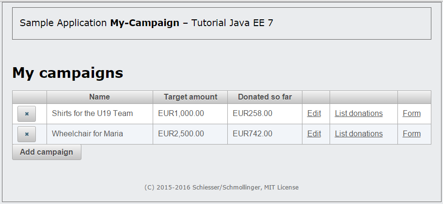
Fig. 10-4 Campaign list with PrimeFaces components and new buttons for deleting a campaign
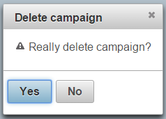
Fig. 10-5 PrimeFaces confirmation dialog box that appears when campaign is deleted
Congratulations!
You have now successfully completed the first iteration! Just one small task remains: In order for later stages of the workshop to function without problems, it is crucial that you complete exercise 11.1. All other exercises are optional. Unless you are explicitly instructed otherwise, the results of the optional exercises must be reversed after completion to avoid unwanted side effects on later parts of the workshop.
Discussion
Use the message board below to give the authors your feedback or to discuss this page’s topic with other readers (in English please!). Please don’t expect the authors to answer directly, but they might update the content of this site according to your feedback.